The 7 Marketing Sutras
Building a strong foundation with a complete brand revamp
Savy | Rebranding
Savy offers innovative and quality-driven software development solutions to a diverse clientele.
With their focus on delivering the best-suited solutions to their customers, Savy grew multifold within a short time.
The brief
Skilled, motivated people are the building blocks of any successful organization. On a fantastic growth curve, Savy also felt the need to attract, hire, and retain the right people. To keep up with the increasing demands and deliver quality output, Savy wanted to release recruitment ads targeting the right audience.
The challenge
From the get-go, we understood that this was not just a matter of creating a recruitment campaign. The recruitment challenge was only the tip of the iceberg. Underneath that was a much apparent problem that needed to be addressed. It was essential to develop a brand for Savy that communicates its essence to the audience and connects them with it.
Getting the basics right
We understood that we needed to employ a different approach. An approach that will build and promote the brand from the ground up, and make Savy more visible, while addressing talent acquisition and retention in the long run. Hence the “7 Marketing Sutras” were developed for Savy, which focussed on all the aspects of branding and communication. It was crucial for the success of this project that we start at the right place. To completely revamp a brand’s image, we first need to understand the brand, the people behind and their story. Hence, we conducted various interviews with the Savy team. During these interviews with the management, HR and other departments, and the various other stakeholders, we identified the core beliefs that make up Savy. Understanding the dynamics gave us a clear idea of what our action plan should be.
A new, vibrant identity
We started with redesigning the Savy logo. Without losing touch with the brand values, a new aesthetic identity was created. With the red curve talking about ambition and the curved font conveying openness, the new logo stood apart from the rest, reflecting a dynamic culture of growth. It is never enough just to rebrand the logo. What is also essential is to communicate about the change. The Savy Brand Guideline explains the brand, the various brand elements, and how to make correct use of these elements to the audience.
Achieving the impossible
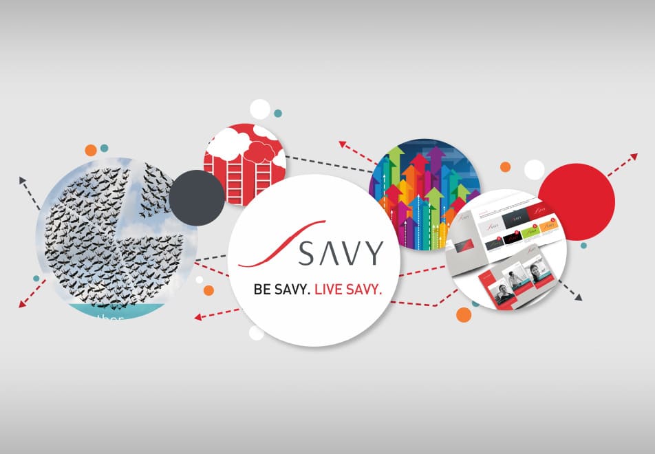
The next step was to reach the TG and make them aware of the new Savy. For that purpose, we worked on developing multiple touch points.
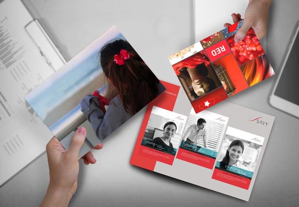
An animation film revealing the new logo. A new website, completely designed and developed, keeping to the new brand guidelines. Recruitment ads to attract the best candidates. Branded employee introduction kits and stationeries for the new joiners.
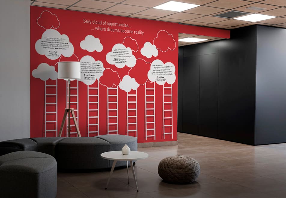
We understood that it is as important to keep the interest of the current employees as it is to attract new, potential candidates. Internal and festive mailers were designed and released to ensure effective engagement with the existing workforce. To further uplift their spirit, the entire office space was branded over the weekend as a surprise. We also worked together with the HR department of Savy on standardizing and documenting different HR policies.
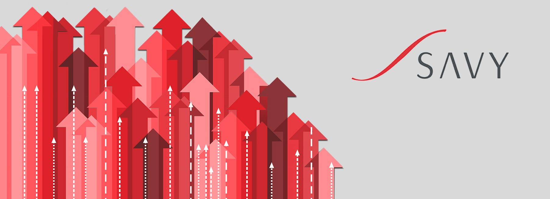
Small changes, a huge impact
The results of the rebranding campaign were visible from the start. Savy witnessed great growth in the number of employees. This organizational growth came together with a positive brand image, increased brand visibility, improved ratings on review sites, and above all satisfied, happy employees.